Interactive, Digital and Graphic Design Examples Using Diagrams

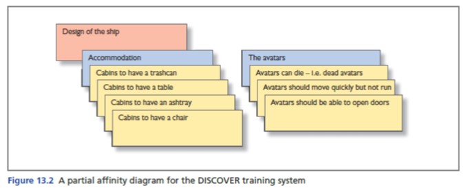
Affinity Diagrams
- Write down every idea you have
- Group similar ideas
- Give each group a name
- Now group these groups
- Continue this process until you have one top note
- The affinity diagram should now be a hierarchy of all of your notes grouped – like a family tree!

Affinity Diagram Example
- food ordering & delivery app
- food
- menu & food items
- restaurant information
- order & delivery process
- order history & management
- user
- user profile & settings
- user engagement & feedback
- food
food
Menu & Food Items
- Allergy information
- Beverage options
- Cuisine type
- Dietary preferences
- Dish description
- Ingredients
- Menu categories
- Menu item images
- Menu item options
- Vegan/Vegetarian option
Restaurant information
- Availability status
- Popular items
- Restaurant hours
- Restaurant location
- Restaurant reviews
- Star rating
Order & Delivery Process
- Cart summary
- Delivery driver tracking
- Delivery fees
- Delivery time estimate
- Food preparation time
- Multi-restaurant orders
- Order confirmation
- Order instructions
- Order status updates
- Reorder option
- Special instructions
- Tipping options
Order History & Management
- Order history
- Favorites list
- Wish list
user
User Profile & Settings
- Account settings
- Address book
- Billing information
- Delivery address
- Loyalty points
- Payment options
- User profile
User Engagement & Feedback
- App notifications
- Contact customer support
- Feedback and reviews
- Push notifications
- Rating system
- Share option
Storyboard Diagrams
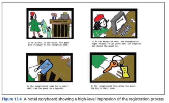
- A storyboard is like a comic
- There is a sequence of pictures that explain a story
- There should also be notes that explain each image
- The purpose of the storyboard is to explain the process of one action in a very simple way that is easy to understand.
- Therefore it is a good way to communicate your design.

Wireframe Diagrams
What is a Wireframe?
- clear and logical layout
- Information design, navigation design and interface design
- Capture a skeleton of a general page
- wireframe = structure, style sheet = visual language
Skeleton
- Layout = need to identify the key components of the design for each different type of page
- Appropriate objects
- type of object – e.g. navigation bar, search box, headline,
- item content
- it is no good having a drop-down menu if the user has to search through hundreds of items
Information architecture
- how the content is classified and organized
- you can use your affinity diagram
think
- how to label the items and categories,
- how to describe the content in the site and
- how to present the architecture
- classify by alphabetical order, date, size, newest, most popular, most expensive / cheap
approach
- Task-based: ‘Buy a Car’
- Audience: ‘Car Buyers’
- Topic-based: ‘Cars’
- Department: ‘Sales Department’
- clear and logical layout
- Information design, navigation design and interface design
- Capture a skeleton of a general page layout.
- Interactions
- buttons
- menus
- what will the user click, how will they know, what will happen
- Vocab
- what is written for the user (for interaction)
- visual hierarchy
- make it clear & simple
